

Can Panettone
Packaging Design
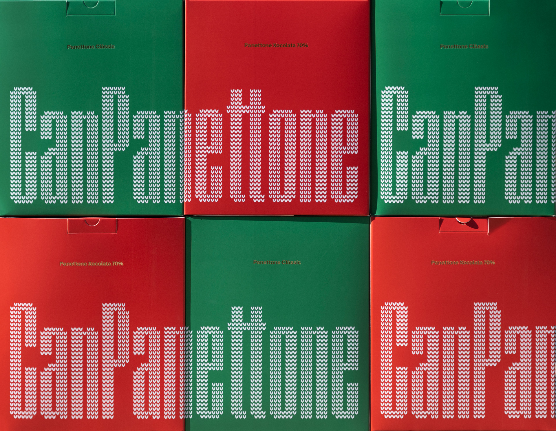
For Can Pa’s limited-edition Panettone, we created a complete naming and packaging concept that highlights the bakery’s identity with a festive twist. We began by developing the name “CanPanettone”, a playful blend of Can Pa and Panettone that instantly ties the product to its origin while giving it a memorable identity.
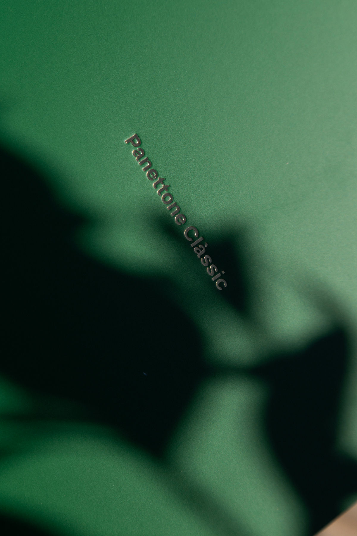
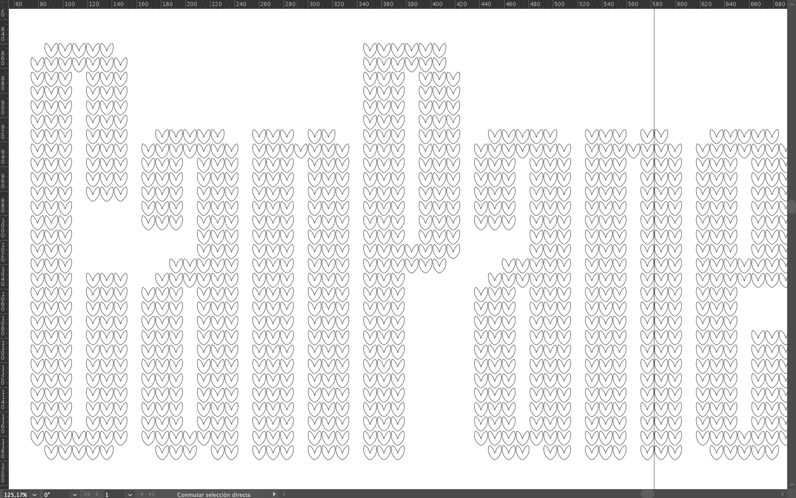
Building from this name-first approach, we designed the packaging for the two flavour varieties — classic and chocolate. The design is driven by strong, clean typography paired with a textured pattern inspired by traditional Christmas sweaters. To distinguish the flavours, we introduced two colour variants, keeping the design consistent.
The result is a simple yet striking packaging solution that balances a festive character, typographic clarity, and the craft values of Can Pa.


Let’s start a journey together!
hello@bypositive.es
